Introduction to the Importance of Presentation Design
A professional presentation design is essential when you need to capture your audience’s attention, communicate your message, and leave a lasting impression. Such a design possesses some features, including masterfully integrated visuals, simplified information even if it is complex, and a reasonable number of slides.
You will transform your ideas into effective slides through a powerful presentation design, whether in business, education, and more.
Presentation design does not mean just a bunch of pretty-looking slides. It is a weapon that targets the audience’s attention and brings the best results. Continue reading to understand why an excellent presentation design always matters for success. You can also get in touch with our professional team at Do My PowerPoint for all your powerpoint design services.
| Aspect | Description |
| Captures Attention | A well-designed presentation grabs and holds the audience’s focus. |
| Enhances Comprehension | Visuals help simplify complex information, making it easier to understand. |
| Leaves a Lasting Impression | Effective design ensures the message is memorable and impactful. |
| Leverages Visual Processing | The human brain processes visuals faster than text, improving communication efficiency. |
| Boosts Presenter Confidence | A polished design gives presenters confidence, leading to better delivery. |
| Applies Across Contexts | Whether in business, education, or public speaking, strong design ensures professionalism. |
| Transforms Ideas | Thoughtful presentation design turns ideas into engaging and impactful stories. |
Did you know that our brains process visual information 60,000 times faster than text?
Says Presentation Process.
This single remarkable fact explains why we remember only 10% of what we hear but 65% of what we see. Hence, visual design plays a very informing role in leaving lasting effects on presentations.
Most of us have seen our fair share of presentations that were excruciatingly boring and others that really kept us on the edge of our seats. The difference lies in how presenters use visuals to convey their message effectively. Good presentation design is not about simply creating beautiful slides but is actually about strategically using visuals to enhance understanding, improve retention, and deliver your message with impact. You can find more information in the article “What is Presentation Design PowerPoint?” and “Presentation design principles“.
Creating effective presentations is an art, and at do my powerpoint presentation design agency, we certainly know how to make ideas bloom into beautiful visual stories. Visual design isn’t just about making the slides look good but rather Strategic use of visuals to engage, inform, and persuade. In this detailed guide, you’ll learn how we help clients achieve presentation success through the power of visuals. You can see Our Presentation Design Services.
Understanding Visual Communication in Presentations
The science behind this visual communication shows some fascinating insights into how our brains process visual information. Visuals are major elements when it comes to presentation design, and understanding these will help us better create audience engagement.
Impact of visuals on information retention
Visual elements significantly affect how people retain information in presentations:
| Information Type | Retention After 3 Days |
| Written/Spoken | 10-20% |
| Visual | 65% |
| Visual + Oral | 85% |
For one, studies show visuals can enhance learning up to 400%. In fact, the benefits become realized, particularly when you have those presentations where:
• Written directions are understood 323% more when accompanied by images.
• Presenters using visual aids are able to persuade audiences 43% more.
Use PowerPoint design services to make the greatest impression.
Current trends in presentation visuals
Presentation Design Trends to watch for 2025:
1. Minimalist Approach: The presentation designs are now done with clean and uncluttered layouts, favoring the content instead of decorative elements.
2. Interactive Elements: Static presentations give way to interactive charts for immersive experiences.
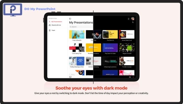
3. Dark Mode Design: This aesthetic decision reduces eye strain while maintaining aesthetic appeal. It is perfect for presentations that take a long time.
As described earlier, research backs up these trends, documenting that content featuring color visuals sees an 80% boost in engagement. Note that visuals are powerful tools that shape the way an audience will process and retain information-not just decoration.
We incorporate these insights into each presentation designed at do my powerpoint From incorporating information graphics, videos, and high-impact images, we aim to make your message stick.
Essential Visual Elements for Effective Presentations
Let’s dive in to explore the necessary building blocks to make presentations visual. Our experience as presentation designers tells us that, once grasped, these core elements can elevate an average slide show into a visual story that captivates your audience.
Types of visual content
Six major types of visual content can raise the quality of any presentation:
| Visual Type | Best Used For | Impact Level |
| Slideshows | Business presentations | High engagement |
| Infographics | Complex data visualization | Enhanced retention |
| Videos | Dynamic storytelling | Highest engagement
Source: Zoho |
| Charts/Graphs | Data presentation | Clear understanding |
| Interactive elements | Audience participation | Active engagement |
| Poster formats | Academic presentations | Extended viewing |
Balancing text and visuals
Creating meaningful slides requires the right balance between text and visuals. Keep things basic and don’t clutter your slides with information by using simple and to-the-point text. Our tried-and-true method for this includes:
• High-quality images which directly help to supplement your message
• Congruent branding throughout the presentation
• Text used for only the most important talking points
• Text and visuals that complement each other rather than compete
Visual hierarchy principles
Visual hierarchy is the secret sauce that makes presentations work. This approach organizes content so viewers naturally focus on the most important elements first. These key factors affect hierarchy:
1. Size: Larger elements naturally draw more attention
2. Color: Bright colors capture attention before muted shades
3. Contrast: Creates focus points and improves readability
4. Alignment: Establishes order between design elements
5. Whitespace: Helps separate and emphasize content
The visual hierarchy reduces the cognitive load and makes the complex information more available. Your audience can grasp the presented content lot quicker by these principles. By using these elements strategically, the audience’s attention is guided to key messages while keeping them genuinely engaged.
Consistency in these visual elements strengthens the presentation’s impact. This approach reinforces brand recognition and builds credibility along with audience trust.
Strategic Implementation of Visual Design
Strategic visual design can make the difference between a forgettable presentation and one that leaves a lasting impression. Our research shows that successful presentations need more than great visuals – they need effective implementation.
Choosing the right visual format
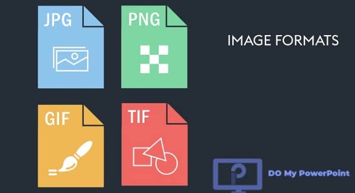
The right image format plays a vital role in presentation design. Here’s a comparison of the most effective formats:
| Format | Best Used For | Key Advantage |
| JPEG | General images | Most popular for web, smaller file size |
| PNG | Screenshots, logos | Supports transparency, ideal for PowerPoint |
| TIFF | High-quality prints | Superior image quality |
| GIF | Simple animations | Small file size, good for simple graphics |
Maintaining brand consistency
According to Frontify, presentations with consistency of brands can yield profitability of over 20%. We realize this through:
1. Color Consistency: Using brand-specific color palettes throughout the presentation.
2. Typography: Adhering to sans serif fonts for increased screen readability.
3. Template Usage: Developing a branded master deck with adaptable layouts.
4. Visual Elements: Maintaining uniformity in style among images, icons, and graphics.
You can transform your presentations into impactful visual stories. First, revisit your ongoing presentation materials and make sure they deliver on these strategic design principles for visuals. Your audience will respond with attention and better retention of your message.
Maximizing Impact Through Visual Storytelling
You can create Presentations that engage, persuade and get Results. It engages the audience when it makes the telling of ordinary presentations unforgettable, striking a chord long after the audience have left the conference room. In working with numerous presentations, we have learned that it seems there is a natural connection between the human brain and emotional stimuli through visual storytelling.
The emotional reaction is created through the build-up of tension at the beginning of the story followed by some type of resolution towards the end of the story. This principle has helped us change countless presentations from basic information delivery to compelling narratives.
Creating emotional connections
Our presentation design focuses on emotional engagement because it substantially affects decision-making and information retention. Research shows emotions are crucial in shaping perceptions and influencing behavior. These connections emerge through:
• Use relatable scenarios
• Incorporate authentic storytelling elements
• Build tension through visual progression
• Release resolution at strategic moments
Story arc visualization
The most effective presentations follow a clear story arc structure. which is a powerful tool to engage audiences. A successful story arc includes:
1. Hook: Start with a compelling visual that creates immediate interest
2. Build: Layer information through progressive disclosure
3. Peak: Present the key message with maximum visual impact
4. Resolution: Conclude with a clear takeaway
Your presentations can become powerful visual narratives. The first step is mapping your story arc before adding visuals. Choose your visual elements carefully for maximum impact.
Would you like to create presentations that leave a lasting impression? Our visual storytelling experts can help you craft compelling narratives that your audience will remember. Book a consultation today.
Designing for Different Presentation Contexts
The success of a presentation depends on how well it fits its context in today’s business world. Organizations save considerable time and money with virtual presenting. They also reach wider audiences.
In-person vs virtual presentations
Here’s what we learned from our experience:
| Aspect | Virtual Presentations | In-person Presentations |
| Audience Focus | Slides are front and center | Presenter is the focal point |
| Engagement Need | Every 5 minutes | Every 10-15 minutes |
| Visual Design | More frequent slide changes | More image-based, less text |
| Attention Span | 5 minutes average | 12 minutes average |
Industry-specific considerations
The industry context can substantially alter presentation design. These factors matter most:
1. Technical Requirements: Resolution and sizing must match the venue
2. Brand Guidelines: Colors and typography that match industry standards
3. Content Complexity: Visual complexity should match audience expertise
4. Time Constraints: Each industry has its own presentation duration norms
Audience adaptation strategies
Understanding the audience is vital to presentation success. This approach works best:
• Pre-presentation Research: We learn about audience demographics and expectations
• Content Customization: We adjust terminology and examples for specific groups
• Visual Adaptation: Design elements change based on audience priorities
• Engagement Tactics: Interaction methods suit the group size and setting
“Understanding your audience is key to any pitch and speaking with the event organizers helps you determine whether you’ve got a great fit or you have to go back to the drawing board”.
Visuals need proper planning and preparation for different contexts. Virtual presentations need more frequent visual changes and interactive elements. The audience attention spans have decreased drastically over the years.
Our expert team can help create adaptable, engaging presentations that strike a chord with your audience. We work with both virtual and in-person formats. Contact us today to discuss how we can help you design presentations that reshape the scene across all platforms.
Technical Aspects of Visual Design
Technical aspects of visual design work like conducting an orchestra – every element needs perfect harmony. Our experience designing presentations has taught us that solid technical foundations are what make a presentation go from good to great.
Resolution and sizing
Size plays a huge role in presentations. According to PresentationPoint :
the maximum dimensions for a PowerPoint presentation are 5835 x 5835 pixels. The following standard formats have been most effective.
| Display Type | Resolution | Best Use Case |
| HD Screens | 1920 x 1080 | Television displays |
| Standard | 1280 x 720 | Default PowerPoint |
| Custom | 2880 x 1800 | MacBook presentations |
Color theory application
Color does more than just look good – it’s a powerful communication tool. Color theory research reveals:
• Warm colors communicate energy and optimism
• Cool colors convey professionalism and peace
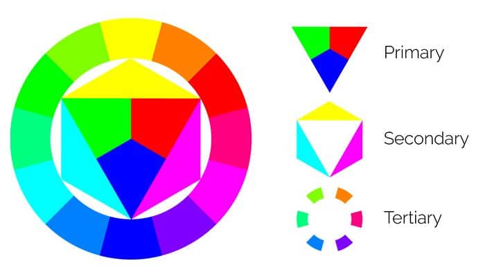
The theory of colors explains: their interactions, impacts on emotions, and visual harmony. The basic elements are the color wheel, color harmony, and context of colors. Sir Isaac Newton created the color wheel, which organizes colors into primary hues—red, yellow, blue—secondary hues—orange, green, purple—and tertiary hues, showing relationships among them. Contrasts, which are vivid, can be created with complementary colors such as blue and orange; analogous colors like green and yellow bring cohesion. Color theory is the cornerstone of design, art, and marketing—since it helps creators send out an aesthetically pleasing, emotionally resonant piece.
 Typography in visual design
Typography makes a big difference when presenting effectively. Modern slides use minimal text, making font choices matter much more. Here’s what works best with typography:
1. Font Selection: Sans serif fonts, such as Arial or Helvetica, work best for body text, especially on digital screens. We have an article on the best fonts for PowerPoint presentations.
2. Hierarchy: Size is the principal differentiator; bigger text will carry higher importance.
3. Spacing: Proper leading (space between lines) facilitates readability of content.
4. Consistency: Use one font for headers and one complementary font for body text
White space provides room for text to pop out and not get lost into the background. Font weight from ultra-light to extra-bold maintains hierarchy and leads viewers’ eyes through your content.
Want to take your presentation’s technical design to the next level? Our team of experts can make you proficient in those technical details. Your presentations will look awesome and work seamlessly. Let us help you for free regarding your presentation’s resolution, color scheme, and typography.
Common Visual Design Pitfalls and Solutions
Our experience in designing presentations shows that even seasoned presenters make common design mistakes. According to an article in Linkedin:
The audience spends 68% of their time reading cluttered slides instead of listening to the presenter. These pitfalls need solutions to create more effective presentations.
Avoiding visual clutter
Visual clutter ruins effective presentations. Proper engagement of visual and listening channels leads to better information retention compared to presentations without visuals. We solve this challenge through:
| Common Clutter Issues | Our Solutions | Impact |
| Text overload | Use charts/graphs | Better retention |
| Multiple diagrams | Single focused visual | Clearer message |
| Busy backgrounds | Clean design | Boosted readability |
Because much of the business world uses PowerPoint to share data among teams, it’s natural to want to put every data point and every clarifying message on a slide to ensure the reader will understand it—even if you’re not there to explain it. But we know that less works better.
Fixing inconsistent design
Professional presentations need consistency beyond just looks. These areas need attention to maintain design consistency:
1. Font Management:
• Safe fonts work in any platform
• Custom fonts need embedding
• Size should stay consistent
2. Layout Structure:
• Titles line up across slides
• Logos need uniform placement
• Margins and spacing remain consistent
3. Visual Elements:
• Color schemes should stay limited to few colors
• Charts and graphs need uniform styling
• Images require consistent treatment
Managing visual overload
Presenters often try to convey lots of information in one go. Text-heavy slides are confusing for audiences because they cannot read and listen at the same time. The following strategies help reduce the problem:
• Progressive Disclosure: Information appears gradually with your speech
• Focus Direction: Highlight boxes guide attention
• Content Reduction: Slides should feel almost empty
Switch your blocks of text for clear, relevant images or use alternative layouts to avoid bullets. Your audience can then glance at the slide presentation and listen to the presenter without becoming overloaded.
Best Practices to Manage Information:
1. Before the Presentation:
• Each slide requires an audit
• Redundant information has to go
• Visuals should replace text where possible
2. During Design:
• White space requires strategic use
• Clear visual hierarchy
• Key messages require focal points
3. After Initial Design:
• Review for consistency
• Sample audience should test
• Feedback drives refinement
It is believed that appropriate utilization of visual and listening channels increases the retention of information. Our suggestions are:
• Visual are better than text
• Strategic information reveals through builds
• Essential elements should remain after cuts
Before concluding this article, we also suggest you watch this video made by Prezi YouTube channel:
The best presentation design practices:
Your cluttered presentations can become clear, effective visual stories. Our design experts at do my powerpoint will help you use these proven strategies to create engaging presentations. Book a consultation with us today to make your presentation a more visually appealing one.
Conclusion
Visual design turns plain presentations into dynamic persuasive tools. A presentation using strategic visuals is more effective/persuasive than one without. Our look at principles of visual design illustrates the ways in which these implementations increase audience engagement and retention.
Should your presentations need a makeover. Step number one is to audit your present slides against these principles. Expertise in the use of the principles of visual communication, such as visual hierarchy, balance of text to image ratio, and color, will help in transforming PowerPoint presentations from ordinary into extraordinary. Nothing should be overlooked; from corporate pitches to academia to creative storytelling, in order to make a permanent impression on viewers’ minds.
Are you ready to take your presentations to the next level with great visuals and a perfect design? Here at domypowerpoint, we understand that every presentation is unique—just like your audience. Our specialty is creating sensational, professional PowerPoint slides that will not only steal the show but also convey the right message. The cost of PowerPoint Presentations is an important factor to consider when planning your next project.
See our powerpoint presentation price list and find an appropriate one according to your need. Whether it’s making just a few updates or completely redesigning (powerpoint redesign services), we will assure you get the best deal possible. Don’t let any more opportunities lose on account of unremarkable slides; take this up and step towards presenting memorable presentations.


 Typography in visual design


Dorothy Dixon
I’m curious about the balance between text and visuals. Is there a recommended ratio or guideline to ensure that a presentation is neither too text-heavy nor overly reliant on images?
Admin
A common guideline is the 10-20-30 rule: no more than 10 slides, lasting no more than 20 minutes, with a minimum font size of 30 points. While this doesn’t specify a text-to-visual ratio, it encourages concise content and readability. Additionally, incorporating visuals that complement and reinforce your key points can create a balanced and engaging presentation.
JoBeveridge
The use of white space, contrast, and alignment is something a lot of people ignore, yet these small details make a huge impact on readability and engagement.
Fulmer
I’ve definitely sat through presentations that were unreadable because of bad design. Tiny text, weird color choices, too much information on one slide—it makes such a difference when a presentation is well-structured.
Susan wilson
I think the piece could dive deeper into the balance between design and content. Sometimes, flashy design overshadows the message. How do you suggest designers find that balance?
Admin
Great point! It’s all about ensuring that the design complements, rather than overwhelms, the content. We’ll explore tips on balancing content and design in future updates to help designers make more informed decisions.