Are you tired of designing lifeless PowerPoint presentations that put your target audience to sleep? Look no further! This in-depth post shows how you can take your lackluster PowerPoint presentation and convert it into a professional one that will surely amaze and impress your audience with your story. Whether using PowerPoint or Google Slides, these expert design tips will give you a head-start toward building a presentation not just pleasing to the eyes, but also well-expressing your point in just a few seconds. Learn everything from mastery of design principles to a deeper understanding of audience engagement.
Here’s a checklist of essential tips to guide you:
- Designing Professional PowerPoint Slides
- Designing Your PPT with Visual Appeal
- Animations and Transitions
- Balanced Use of Colors and Fonts
- Engage your audience
- Content structure
Are you ready to follow this fascinating tutorial to create a professional PowerPoint?
Understanding the Basics of a Professional PowerPoint
The first step to making PowerPoint is to have the right attitude towards making a professional presentation as a very effective solution.
A professional presentation, in addition to text, requires the use of related images, graphic vectors suitable for slide titles, tables and charts.
Some of these elements are dependent on your content type, and others are created during design. Therefore, it is very important to focus on creating tables and charts when creating content so that numbers and words can communicate well with your audience and convey the message in the best possible way.
The following are the key elements that form an exceptional presentation:
• Messaging to your audience in a clear, concise, and resonating way can make your point effectively.
• Consistent design theme across the presentation that reflects professionalism and attention to detail.
• Effective and purposeful use of graphics to illustrate a message with clearly presented understanding.
• Logical, easy-to-follow flow of the information that carries your audience through your story
• Delivery of presentation should be engaging, hold audience’s attention and make memorable moments.
• Professional design and layout decisions that convey competence and build trust.
• Appealing use of spacing and visual hierarchy to guide the viewer’s eye to and establish some key points.
A golden tip to have more impact on the audience is your mastery of the designed content. If you master your content, you can present with more confidence and connect better with your audience.
In the Simplitivity YouTube channel, seven simple ways are mentioned to enhance your slides so that your audience stays engaged and amazed:
In addition to the points of the article, good things are mentioned in the video.
- Change the cursor pointer
- Align all your slide objects
- Animate text or images
- Morph slide transitions
- Remove image background
- Add a countdown timer
- Create live polls inside PowerPoint
We at Do My PowerPoint will make a professional presentation with the most appropriate price and the highest quality as quickly as possible so that you can go to the presentation meeting with peace of mind!
 In the following, we will raise points that include design details and how to present them. Join us to create a great experience for you and your audience.
From choosing the right font and using attractive images and charts to methods of attracting audience attention and time management, all these tips will help you create a professional and effective PowerPoint.
By following these tips and taking advantage of our experience, you can be sure that your presentation will not only convey the necessary information, but also help you make an impressive and memorable presentation.
In the following, we will explain the details of each of the things we mentioned.
Introduction
In this regard, in this article we will try to teach you the most important effective parameters in preparing a professional presentation. By following these tips, you can ensure that your PowerPoint not only conveys the necessary information, but also helps you make an impactful and memorable presentation.
“A good presentation is like a good meal. It should be well-prepared, easy to digest, and leave a lasting impression.” – Chris Anderson, TED Curator
Designing Professional PowerPoint Slides
Professional PowerPoint slides require careful design and sufficient time. To produce professional PowerPoint slides, you should pay attention to various features that we will mention below. By introducing these features, you will be able to produce a professional PowerPoint for your presentation.
Here are some tips which are proved to work:
1. Design a template that is clean, modern, and representative of your brand to make that first impression great.
2. Utilize one consistent scheme of colors for visual appeal, emphasizing your message with professionalism.
3. Slides should not be cluttered and overloaded with information. The text should be limited on every slide.
4. Use white space to avoid clutter and make it looking clear and professional.
5. Align elements appropriately to give the professional look and show attention for details.
6. Equally spaced elements give a clean, even feel to the design.
7. Use high-quality graphics and images that enhance rather than detract from the message.
Choosing the Right Template
The first step to having a professional PowerPoint is choosing the right format. Most of the PowerPoint design software, including PowerPoint, Prezi and Keynote, provide free templates to users by default. Because these templates are free and public, they are only suitable for casual presentations.
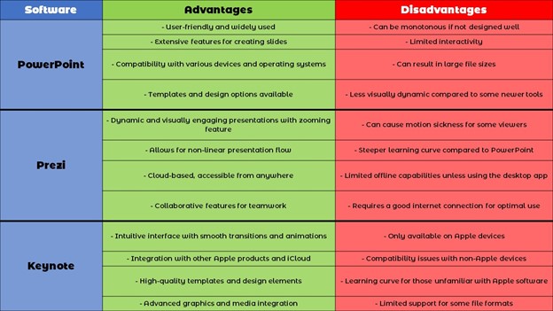
To find out which of these platforms is best for you, get in touch with contact us and complete the online form for a free consultation.
Maybe this question comes to your mind, is it possible to have a special template for PowerPoint? The answer is yes! You can even edit the free templates in the software and design them in a more specialized way.
If you are a little familiar with design, using the “Master” function, you can have more exclusive designs and minimize your time in design.
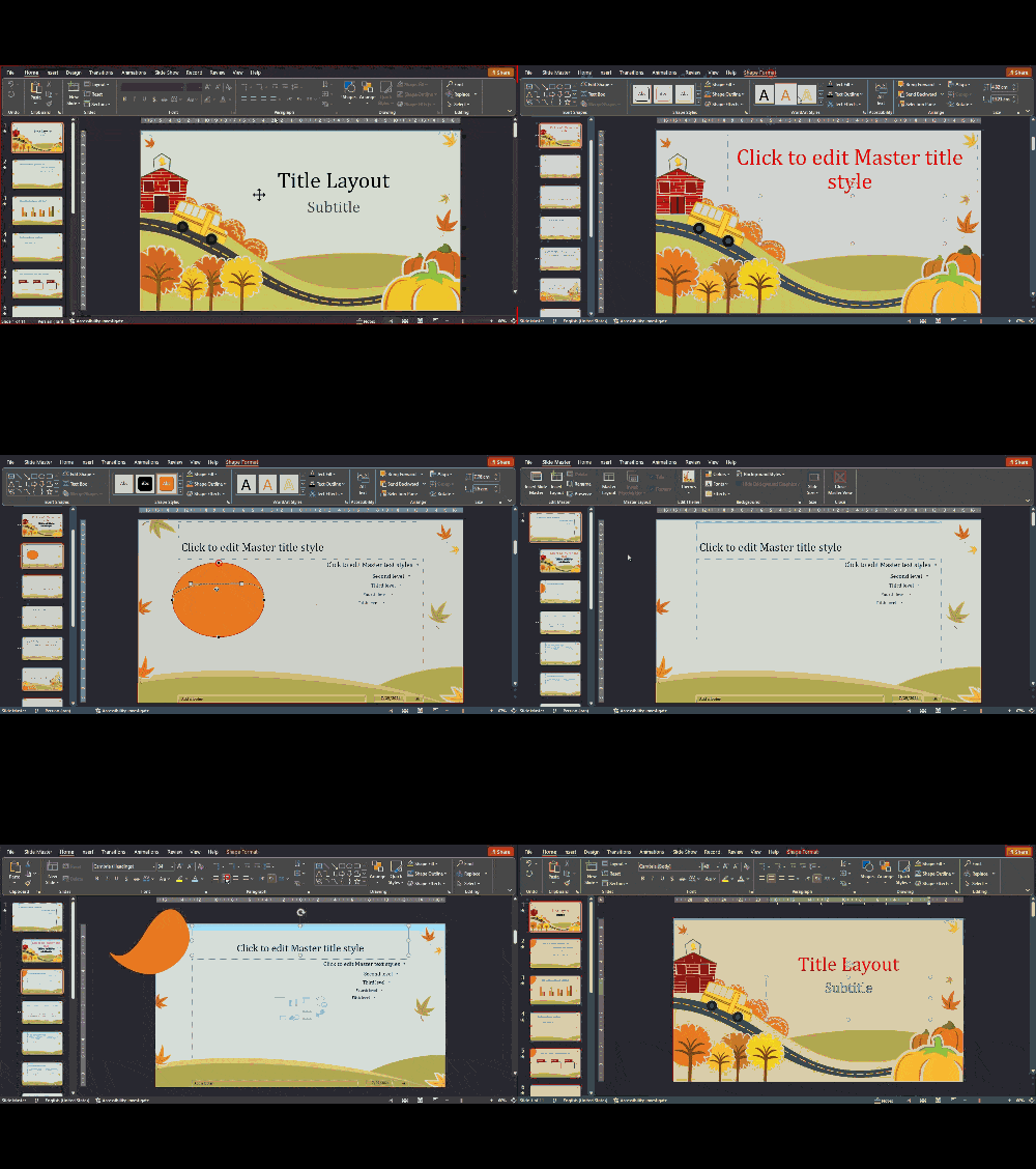
In PowerPoint, through the View tab and using the Slide Master button, you can professionally edit the appearance of the main slides that are displayed during the presentation.
Any item added or deleted in the slide master cannot be changed in normal editing mode (outside the slide master). This feature is very useful.
For example, if you set the fonts for the slide master, you no longer need to set the desired font for each slide when adding content to PowerPoint; Because the main fonts are specified by default.
On the other hand, if you want to add a special icon or logo in your slide, you don’t need to do it separately for each slide. By adding your icon or logo to the slide master, you can apply it to all slides at once. Of course, this ability to create zoomable slides will bring problems that we will comprehensively mention in another article.
Therefore, according to the explanations given, it can be said that choosing the right format is one of the most important things you need to have a professional PowerPoint.
The things mentioned are just a few of the features that you can use to create a professional template for your project. If you don’t have enough time to prepare a professional PowerPoint template, you can benefit from the help of the Do My PowerPoint team!
Read more information in power point design service.
Consistent Slide Layout
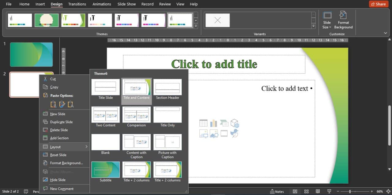
When making PowerPoint, you should be familiar with Layout. By default, every PowerPoint template has 9 layouts, which according to the explanations given in selecting the template and making it more specialized, you will be able to increase or decrease these layouts!
Typical layouts consist of:
- Title Slide: Used for presenting the main title and subtitle.
- Title and Content: Includes a section for the title and a section for the main content.
- Section Header: Used for introducing a new section of the presentation.
- Two Content: Contains two separate sections for main content.
- Comparison: Similar to “Two Content” but with added title sections for each.
- Title Only: Includes only the title section.
- Blank: Contains no elements, allowing free usage.
- Content with Caption: Includes a section for content and a section for a caption.
- Picture with Caption: Used for displaying an image with a caption.
As mentioned, you can edit each of these layouts professionally. Title and Content layer is usually used to insert content.
Of course, other layers also have uses that are not the subject of this training and we will fully address them in a separate training. To use different layers, you can choose any layer you want for that template in PowerPoint editing mode by clicking on different slides and selecting the layer option.
In the following, we will talk about one of the most interesting parts of PowerPoint called “Slide Master” and we will teach you how to work with this part of PowerPoint.
Designing Your PPT with Visual Appeal
For visual appeal in PowerPoint slides, you can prepare different layers through Slide master to have a separate layer according to the content’s characteristics and adaptation.
For example, for content that is text-based, you can design a separate layer that has elements with high opacity along the background with a white background, and for content that is photo-based, you can use the add photo template in the slide master and the crop option.
Arrange the box related to the images in a more specialized way so that when displaying the images, they are not displayed in a stereotyped way.
Using images and graphic vectors in svg and png format can also help the slides to be more attractive, keep in mind that these images and vectors should be appropriate to the topic of your slide and if you can use images and vectors with color Which is close to the color palette of your presentation has a significant impact on the attractiveness of your presentation.
Also, sometimes the use of tables and charts can give a comprehensive summary of different topics or using them to summarize the content will also help to have more integrity for your topics and provide visual appeal.
Another item that can be effective on visual appeal is the use of animation and transitions, which we will mention below.
Animations and Transitions
The ability to use animation and transition has always existed in the PowerPoint environment, and with the updating of different versions of the software, the features of these two parameters have been improved. For example, in the latest updates, we can mention the use of glow and bounce elements for 3D vectors and morph functionality for transitions.
What is very important in creating a professional PowerPoint is the correct use of these features. Considering the different variations that exist in these two parameters, you can take advantage of these features by understanding the psychology of the audience and knowing their age.
For example, if you are preparing a formal business meeting, you should not use the Origami transition, which resembles the movement of a bird. But you can use the same transition for a child audience and see how much it delights them.
Similar points apply to animations. In some cases, presentation time is critical, and for a faster presentation and more focus on content, you shouldn’t set content entry animations with By click (clickability). But in some presentations, each slide parameter needs to be entered after the topic is completed, and in this case, you need to set the animation so that it enters the slides on click.
Advanced Animation and Transition Techniques:
| Technique | When to Use | Best Practices | Examples |
| Slide Transitions | Between major sections | Use simple, uniform transitions (e.g., fade) | Fade transition between introduction and body |
| Entrance Animations | Introducing key visuals or text | Keep it smooth and avoid multiple effects | Text appears with a fade-in animation |
| Emphasis Effects | Highlighting critical data | Use sparingly to maintain attention | Pulse effect for “Key Statistic” in a slide |
| Exit Animations | Removing completed topics | Use quick, subtle effects (if necessary) | Shrink-out effect for checklist items |
| Custom Motion Paths | Demonstrating processes or flows | Align timing with verbal explanation | Arrow following a path in a process slide |
Finally, it should be said that animation and transition parameters have a wide world and have many specialized settings that cannot be mentioned in this article. If you’ve created a PowerPoint and want to make it better, you can employ PowerPoint redesign services to get a professional PowerPoint in the quickest amount of time. In this situation, you can concentrate on your more important activities without worrying.
In the following, we will give instructions regarding the correct choice of font and colors, which play an essential role in the attractiveness of a presentation.
Balanced Use of Colors and Fonts
The correct choice of color and font can make or break your presentation. The issue is that it must all create a visual harmony in which the conscious choice of color and typography supports professionalism and readability.
For example, red color represents energy and being active, and blue color represents honesty and integrity. Also, if you have a business brand, you can use your corporate color palette to create more harmony between your brand and your content presentation.
Detailed Design Elements for a Professional Look:
| Design Element | Recommendations | Why It Matters | Examples |
| Font Styles | Choose modern, clean fonts (e.g., Calibri, Arial, Verdana) | Improves readability and creates a clean look | Title: Calibri, Body: Verdana |
| Font Size | Title: 28-32 pt; Subtitle: 24-26 pt; Body: 18-22 pt | Ensures text is readable even from a distance | Title: 30 pt, Body: 20 pt |
| Color Schemes | Use 2-3 complementary colors; maintain text-background contrast | Keeps slides cohesive and visually appealing | Blue and white with yellow accents |
| Backgrounds | Subtle, non-distracting designs like gradients or solid colors | Prevents content from being overshadowed | Solid light gray or gradient |
| Margins & Padding | Keep consistent spacing around elements | Avoids clutter and ensures balance | Equal space between text boxes |
If you have trouble choosing color palettes, you can use websites that introduce color palettes for free. For example, the Color Hunt site offers you a variety of color palette options.
In addition to choosing the right color, using standard fonts can also help make presentation slides more professional. According to our work experience, using two different fonts can have a positive effect on the appearance of the slides. Using a different font with a larger size for the headlines and another font with a smaller size for the content can make the importance of the headlines more visible.
For example, choosing the Montserrat font for headlines and the Times New Roman font for other content can help your presentation look professional. Also, keep in mind that some font families, such as Montserrat, have different weights, allowing you to use the same font of different weights for the headline and content at the same time.
By following these tips and specializing the PowerPoint format, you can have a professional and effective presentation.
Continue reading this post if you’re interested in learning how to select visuals and graphic symbols for your presentation.
Using High-Quality Images and Graphics
As mentioned above, the use of graphic elements and images will help you make a greater impact on the audience. The important thing to keep in mind in this section is that the effect of these images and graphic symbols will be effective when the text inside the slides is small.
If you put a lot of explanations inside the slides and the images are also used inside, you will have to reduce the font of the texts or the size of the images, both of which will leave a negative impression on the appearance and attractiveness of the slides.
Therefore, you should use short sentences or short titles for the content and add other additional explanations in the note section related to the desired slide so that only you can see the note section during the presentation.
This feature will allow you to engage your audience with images and graphic symbols and provide the most support for understanding the images and graphic symbols inside the slide!
This trick is great and most famous people can comment on that slide for long minutes by adding a title and an image inside the slide during the presentation, and this in addition to showing you as a professional presenter, your mastery of It will highlight the topic.
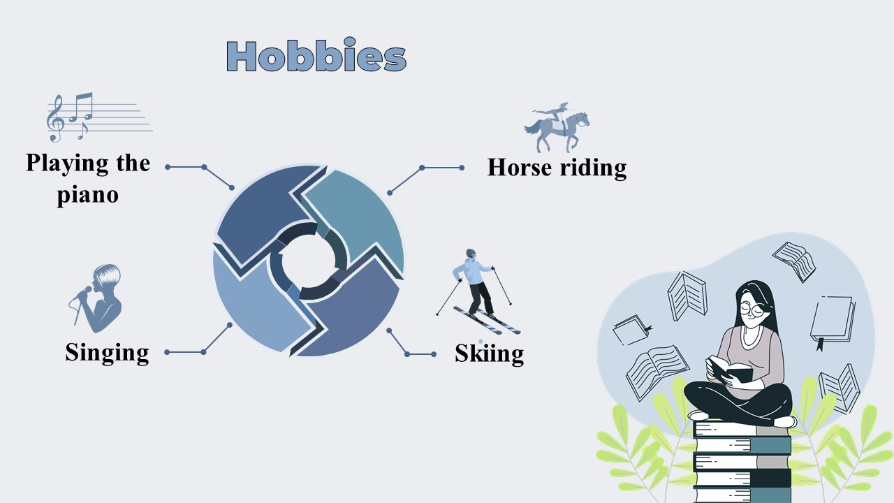
Next, you will see an ideal slide in which these things are observed.
Incorporating Smart Art and Charts
As mentioned above, the use of graphic elements and images can have a great impact on your audience.
The important point in this section is that these images and graphic symbols will be effective when there is little text inside the slides.
If you put a lot of explanations in the slides and use images, you will have to reduce the font of the texts or the size of the images, both of which will have a negative effect on the appearance and attractiveness of the slides.
Therefore, you should use short sentences or concise titles for the content and put other additional explanations in the note section of the slide so that only you can see it during the presentation.
This feature allows you to capture and engage your audience’s visuals and graphics, and gain greater understanding of the visuals and graphics within the slide.
This trick is great and many famous people can spend long minutes commenting on the slide by adding a caption and an image inside the slide. This method not only shows you as a professional presenter, but also shows off your level of mastery of the subject.
You may learn how to start a presentation professionally by reading the rest of this article, which will answer your question on how to have a PowerPoint beginning slide.
Start the presentation
The most important slide to start the presentation is the introduction slide. In this slide, you will mention points that will clarify the importance of the presentation topic to the audience.
In this slide, the process of the presentation should be explained in general and the topics should be discussed in such a way that the reason for choosing this topic and the presence of people in this presentation is clear.
These points should be followed in most scientific presentations, but some that will help you gain more attention in your introduction slide include:
- Use of short sentences: In the introduction slide, you should not use long texts such as paragraphs. You should do this until the end of the presentation and only use short sentences so that the eyes of the audience are not disturbed.
- Using short sentences: By using short sentences, you can explain other things to the audience in your own language, which in addition to helping the slides become quieter and allowing for more design, also helps with time management.
- Asking challenging questions: In the introduction slide, ask challenging questions so that the audience’s mind is engaged and they will follow you during the presentation to find the answers. If your presentation is educational, you should mention the questions that are the main reason for the audience to attend your presentation; In this way, your contacts will communicate with you the most.
- Use of graphic vectors: in the introduction slide, in addition to using short sentences, use graphic vectors related to the topic. Some sites active in the field of design help you to benefit from this feature for free.
For example, you can get attractive graphic vectors for free through the freepik site, depending on the subject of the presentation.
By following these tips, you can design an attractive and effective introduction slide that will make your audience interested in continuing the presentation.
Content structure
Best Practices of Visual Hierarchy
| Hierarchy Element | Why It’s Important | How to Apply |
| Slide Titles | Guide the audience’s focus | Use bold and larger font sizes |
| Images and Icons | Reinforce key points | Align near related text; avoid crowding |
| Bullet Points | Break content into digestible chunks | Keep each bullet concise (1-2 lines) |
| Text Alignment | Ensures readability | Use left or center alignment consistently |
The first slide
At the beginning of a presentation, it is necessary to mention the topic of the presentation in the first slide or the Title Slide layer. Use logos and insignia relevant to that meeting (for example, a student presentation requires the logo of that university or conference, or a company logo in a performance report meeting).
You can include more details of this session on this slide so that they can benefit if this PowerPoint file is shared with different people later. For example, include the name of the authors or presenter and the date of the presentation on this slide.
The second PowerPoint slide
After the introduction, it is necessary to mention the reason for holding this meeting or the topic in the introduction slide so that the audience is informed about the importance of holding this meeting. This introduction can be related to the reason for choosing a topic or introducing and marketing a company.
Next slides
Then you need to mention the details that the audience attended for this meeting. These details can include introducing people, reporting performance, using figures and tables, and including diagrams. The choice of this content depends on the type and purpose of the meeting.
Summary slide
At the end, you should have a summary slide or two so that people can get the results of the session in a nutshell. After that, you should bring up the topic in such a way that in the final slide, you thank the attendees for their attention and provide the possibility of asking questions for the topics that have involved their thoughts.
Suitable slides for audience relaxation
If the meeting is long, it seems important to allow time for breaks during the presentation. Be sure to set up some of your slides so that your audience knows you’ve carefully planned for their breaks.
Crafting Compelling Content
The content you use for your presentation should be the most transparent way of communicating with your audience. Using creativity in summarizing, you should highlight important details on your slides and let your audience know more details during your presentation.
1. Know your audience’s needs and interests through research and analysis. Tailor your content to address specific challenges they face and provide relevant solutions. Consider their knowledge level, industry background, and expectations when developing your material.
2. Compose a key message: communicate to the audience on how your ideas or proposals will help them. Use specific, concrete examples of how your recommendations have a practical benefit. Connect features to results relevant to your audience.
3. Utilize concrete examples and case studies in developing the arguments, pointing at situations that might correspond to the experience of your audience. Give full background and crystal-clear outcomes to show how well your suggested solutions or ideas work.
4. Include relevant statistics and data; all figures must be recent, accurate, and sourced. Set all data in context to make it both significant and memorable for your readers. When possible, use comparisons or analogies to set large numbers or abstract statistics in context.
5. Use storytelling that your audience can identify with and that reinforces key information. Use narrative methods that will connect emotionally to help viewers remember key points. Arrange the story to include a distinct beginning, middle, and conclusion that focuses attention on your bottom line. Add particular details to make the story more interesting and memorable.
You should not use clichéd sentences or vague figures and numbers in financial discussions. For example, if you have a specific number for a budget, you should specify the final figure and then state the topics that need to be spent on this budget in the form of headlines. This method is better than providing many explanations and long paragraphs.
In financial sections, it is better to use statistical tables and charts so that statistics and figures are clearly displayed. This will make the mind of the audience accept and trust your words more. Also, using these tools can make your presentation more professional and understandable.
Conclusion
We attempted to highlight the most crucial instructional topics in this post that are required in order to design and deliver an excellent presentation. Each of the aforementioned elements contains crucial information that will enable you to use particular standards and ideas to have the most impression on your connections. We made an effort to teach you the essential components of these standards and principles; however, if you want to cover all the details and key points of your presentation, you can use the professional PowerPoint slide design services of Do My PowerPoint to save time and attend the presentation session without stress. So, contact us as soon as possible and register your PowerPoint project after receiving a free consultation.

