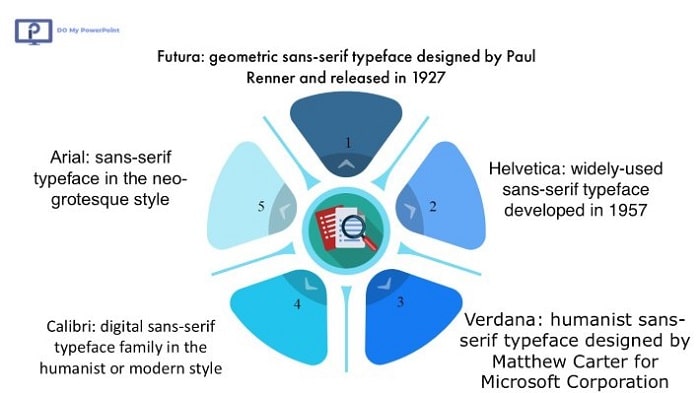
Opting for the right font makes a big difference when looking to create an effective PowerPoint presentation. Some well-known fonts such as Arial, Helvetica, Calibri, Futura, and Verdana are more attractive and readable due to their appearance and can suit your professional presentations the most.
If looking for more clarity in the body text, Arial and Verdana are sans-serif fonts and highly recommended. On the other hand, Calibri is a better option for the whole text, including the body and titles, with its chic, leading-edge look.
| Font Name | Style | Best For | Key Features |
| Arial | Sans-serif | Body text, professional presentations | Clean, highly readable, widely available |
| Calibri | Sans-serif | Titles and body text | Modern look, balanced proportions |
| Helvetica | Sans-serif | Titles, creative presentations | Sleek and professional, excellent for large text |
| Verdana | Sans-serif | Small-sized text, online presentations | High clarity at small sizes, widely compatible |
| Futura | Geometric sans-serif | Bold headlines, modern designs | Clean lines, visually impactful |
We at Do My PowerPoint are ready to help you with your design needs, whether a pitch deck or a creative slideshow.
Before continuing, you can also take a look at our previous article on which we have talked about fonts and how to become expert in powerpoint.
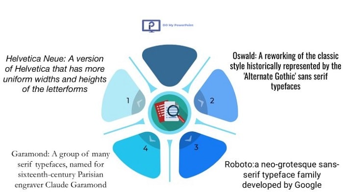
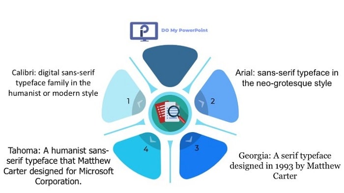
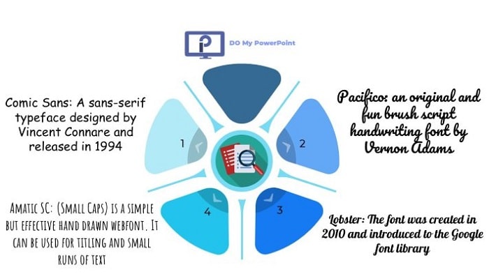
Here is a graphic covering all font styles mentioned in this article:
Want More Presentation Design Services Tips? Head Over to Our Blog Now for Expert Opinions!
Of course, fonts are far from being everything! A great PowerPoint is all about smart color choices, visual hierarchy, and effective layout design.
Best Font for PowerPoint Slides
The best overall font for your slides is a matter of perfect balance between professionalism, readability, and style. A well-chosen slide font should look clean, be highly legible, and have a neutral appeal to fit into any content.
Overview of the Best PowerPoint Fonts
| Font | Description | Ideal Use |
| Arial | a sans-serif font, well known, very readable, and supported by most of the systems | Body text |
| Helvetica | Timeless, clean lines make Helvetica a favorite for modern presentations that need to feel sophisticated and clear | Title & Body |
| Calibri | It’s a font that’s neutral; therefore, it is extremely readable and accessible. Perfect for most presentation types | Title & Body |
| Futura | A geometric sans serif font, modern-looking and sleek, best for impactful titles | Titles |
| Verdana | Designed specifically to be readable onscreen, Verdana’s wide letters make it a readable font at small sizes | Body text |
Why choose these fonts?
Each of these fonts is for a certain purpose. Among them, Arial and Verdana are sans-serif fonts, meant to keep optimum readability, functioning well in the body of the text, while Helvetica and Futura make bold, striking options that will make your title stand out. Calibri manages to balance things out with its smooth, modern look that works both for titles and body text.
According to Piktochart
Good typography can create a visual hierarchy that guides the audience’s eyes to the most important information. By choosing one of these recommended fonts, you’ll ensure that your presentation is professional, cohesive, and easy for viewers to follow.
Best Font for PowerPoint Title
Among the very first things your audience will be seeing is a title font that needs to convey clarity and emphasis. Titles set the setting for what is on a slide; they should, therefore, be catchy, inviting, and noticeable. Below are some of the best title fonts options in PowerPoint:
• Helvetica Neue – Elegant, classic, Helvetica Neue has clear, well-balanced lines that make it perfect for titles, which gives the touch of professionalism and trustworthiness.
• Garamond is a serif font that has a classic look, good for only formal presentation or learning institutions where the old-school look is intended to be maintained.
• Oswald: This sans-serif font has a bold condensed style; hence, it is very well visible and catches the attention of every other person. It is best to give it to titles that require prominence.
• Roboto: Designed by Google, this sleek, modern, and highly readable font for any size will be an excellent option for title of slides that relate to corporate or technology-based presentations.
Why Font Weight and Font Size Matter for Titles
The fonts of titles should be larger and bold to make an impact. The fonts with weights like bold or extra-bold options go well with light fonts in the body. A fantastic example can be a bold Helvetica Neue title with light Arial for the body; it results in a very clean, modern-looking appearance with good visual contrast.
Suggested Font Weight Usage of Titles:
• Bold: Emphasizing, making titles, headers and/or key points more readable.
• Extra-Bold: Ideal for presentations where there is not much content and the title should be very apparent.
• Medium: Suited to subtler emphasis, often used in subtitles or secondary headers.
Font Size: For headings start with at least 36 pt. and adjust depending on a number of words in your heading and balance with other items out on the slide. Titles should be readable from a distance.
Best Font for PowerPoint Text
For body text on your PowerPoint, the font choice is very key; it needs to be legible and not compete with the composition on your slide. Here is a selection of the best fonts for body text on PowerPoint:
• Calibri: highly readable onscreen in very small sizes because of their rounded edges and uncluttered appearance.
• Arial: This is quite plain, simple, and very readable. Highly compatible, Arial is best used in large blocks of text.
• Tahoma: Tahoma is a sans-serif font which is easily readable by small font size, hence suitable for presentation purposes with a large volume of text.
• Georgia: This serif font was intentionally designed for screens, giving it a professional feel for the text, especially on academic or more traditional types of presentations.
Practical Suggestions for Fonts of Body Text
• Font Size: Body needs to be at least 24pt and should be readable across the room. Subpoints or less than critical text can use 18pt-22pt.
• Line Spacing: Allow line spacing to be in a balance-not too cramped, not too loose; well within 1.2 to 1.5 for good readability.
• Color: Make a good contrast with colors against the background, such as dark text on a light background, or the opposite.
Expert’s advice from Buffalo7:
The body font you choose should ensure that your message is readable at any screen size, and shouldn’t compete with more prominent elements like titles or graphics.
Arial and Calibri are very good font options in the body that will not distract from your key points.
Want to make presentation look professional? Let’s make them glitter!
Sometimes, the perfect font is only half the equation. Great presentation design calls for intelligent choices about layout, color, and balance of visual elements. If you’re looking to impress and you need a pro to lean on, our design team is ready to help you out. Contact us today and let your words come alive with the right font and design to match your message! Use our PowerPoint Design Services.
Cute Fonts for PowerPoint
Cute or decorative fonts can make a presentation a little playful, probably in very casual settings, school projects, or maybe even creative events. Here are some of the best “cute” fonts for PowerPoint:
• Comic Sans: Although it is divisive, Comic Sans has a friendly and approachable appearance that works quite well in informal or children-oriented presentations.
• Pacifico: This font is cursive and can be used to bring life to any presentation. Great for title slides or giving emphasis to creative pieces.
• Lobster: bold and curvy font that adds flair to your slides and it’s perfect for fun events or creative content.
• Amatic SC: This is a font that has the feel of a handwritten material; hence, it is very personal. Ideal for headings in casual or even artistic presentations.
How to use cute fonts
Decorative fonts should not be overused; this will overload your audience. The best use is in either headings, captions, or accent words-not in bodies or lengthy texts. Too many of these fonts are a strain to readability and take away the focus from the general message.
Pro Tip: Combine some of the mentioned fonts with Arial or Tahoma-like neutral fonts to add balance in providing an easy-on-the-sight presentation. An example would be using Pacifico on the title slide and Arial on the body of the text.
Check this video made by “Envato Tuts+” explaining What Are the Best Fonts to Use in PowerPoint?
Fonts for Making Different Presentation Themes
Professional and Corporate Presentation
For professional and business presentation, it is advised to use professional and reliable fonts.
• Arial
• Calibri
• Roboto
• Helvetica
Educational and Academic Presentations
In academics, the fonts used must be formal and very readable. Common preference should be serif fonts, since they look traditional:
• Garamond
• Georgia
• Times New Roman
• Calibri
Creative & Artistic Presentation
For presentations in creative fields, use fonts that can show individualism but are still readable:
• Futura
• Pacifico
• Lobster
• Amatic SC
Informal and Fun Presentations
For casual events or light-hearted occasions, choose fonts that give personality and friendliness:
• Comic Sans
• Fredoka One
• Amatic SC
• Lobster
Comparing Fonts by Theme
| Theme | Recommended Fonts |
| Corporate / Professional | Arial, Calibri, Helvetica, Roboto |
| Academic / Educational | Garamond, Georgia, Times New Roman |
| Creative / Artistic | Futura, Pacifico, Lobster |
| Casual / Informal | Comic Sans, Fredoka One, Amatic SC |
Follow us for more font choice and PowerPoint design tips!
Enjoyed this guide to picking the perfect fonts? Head over to the DoMyPowerPoint.com blog now to get updates frequently regarding how to choose fonts, design slides, and construct the perfect presentation that will engage your audience. From font pairing to pro design tips, our blog has got you covered so your slides are both looking amazing and readable.
Advanced Tips for PowerPoint Fonts
• Embed Fonts: Embedding ensures that your fonts will consistently show up, even when opened on different devices.
How: File > Options > Save, check the box saying “Embed fonts in the file.”
• Use Font Pairing: One that immediately comes to mind is the balance of a heavy font for the title and a lighter font for the body.
Example: Futura for title, Verdana for body text.
• Avoid excessive styles in using Fonts: Try not to use more than two fonts throughout the presentation for consistency.
• Test Across Devices / Resolutions: The presentation must be previewed across multiple screen types and resolutions to ensure that fonts look good no matter the size.
Pro Tip from Sliderabbit:
Consistency in font style across your presentation slides helps maintain a cohesive and polished look, especially when sharing with a diverse audience.
Conclusion
The best font choices for PowerPoint go beyond aesthetics; it’s about readability, audience engagement, and how well your presentation comes across. Throughout this guide, we have given you options: everything from classics like Arial and Garamond to creative choices such as Pacifico and Lobster, suiting your different presentation needs.
Following these guidelines and fiddling with font style and combination is the way to create slides to enhance your message, hold audience attention, and be remembered well after.
Save Time, Add Credibility to Your Presentation with Fonts Chosen by Experts! See our affordable powerpoint price and order right now!
Picking fonts may take a little longer, as it’s always hard to anticipate which ones will look awesome on a super big screen. Let us do the guessing! From font selection and slide layout to custom visual creation, PowerPoint Design Agency offers professional PowerPoint design services that will help make your presentation clear, compelling, and to the point. Take care of your next project with us, and let your audience see a showstopper that keeps them focused on your point.


